Case Study
A Smarter Site, a Better Trip: How Discover Puerto Rico Got Both
CLIENT: DISCOVER PUERTO RICO
SCOPE: WEBSITE
CAMPAIGN: WEBSITE UX/UI, CONTENT AND REDESIGN
The Situation
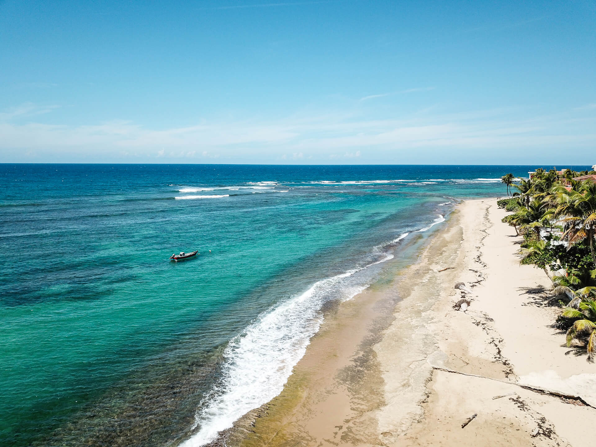
Puerto Rico has no shortage of beauty to share. The challenge? Making sure that richness came through online in a way that felt simple, inspiring, and useful.
The Approach
Our website redesign gave Discover Puerto Rico a digital home that’s as easy to navigate as it is stunning to explore. From trip planning tools to immersive storytelling, the site gives travelers a true sense of the island—before they ever set foot on it.
Summary
Website UX/UI, Content and Redesign
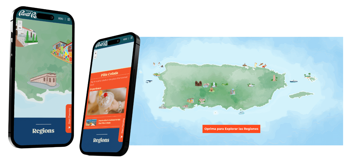
The site’s interactive map doesn’t show you where to go—it pulls you in. With layered visuals, cultural callouts, and intuitive navigation, it transforms the classic “click-to-see” moment into a sensory scavenger hunt. Zoom in, and suddenly the Island isn’t just a shape—it’s a story unfolding in real time.
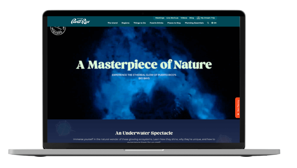
Shine a Little Bioluminescent Light on It
Here’s where things get a little sci-fi in the best way. The Bioluminescent Bays feature glows (literally) with storytelling and science. A glowing cursor mimics the real thing—it’s educational, a little weird, and downright delightful. It brings environmental stewardship into the spotlight without feeling like homework.
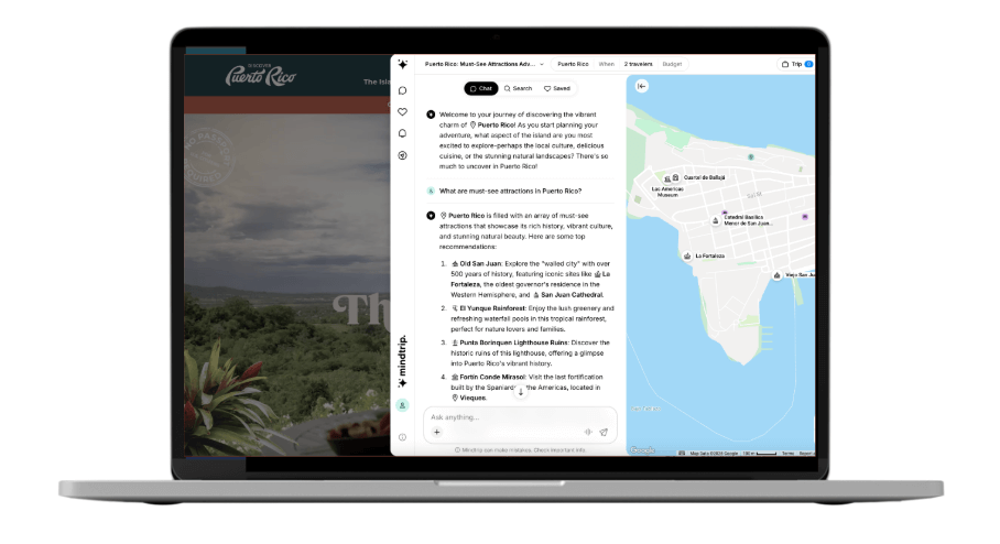
Smarter Than Your Average Chatbot
Most chatbots are glorified FAQs. This one? It adapts. It learns. It gets you. Seamlessly bilingual and tuned into traveler behavior, the bot offers video recs, cultural insights, and guidance that feels eerily personal (but never creepy). It’s like chatting with someone who lives there—because it kind of is.
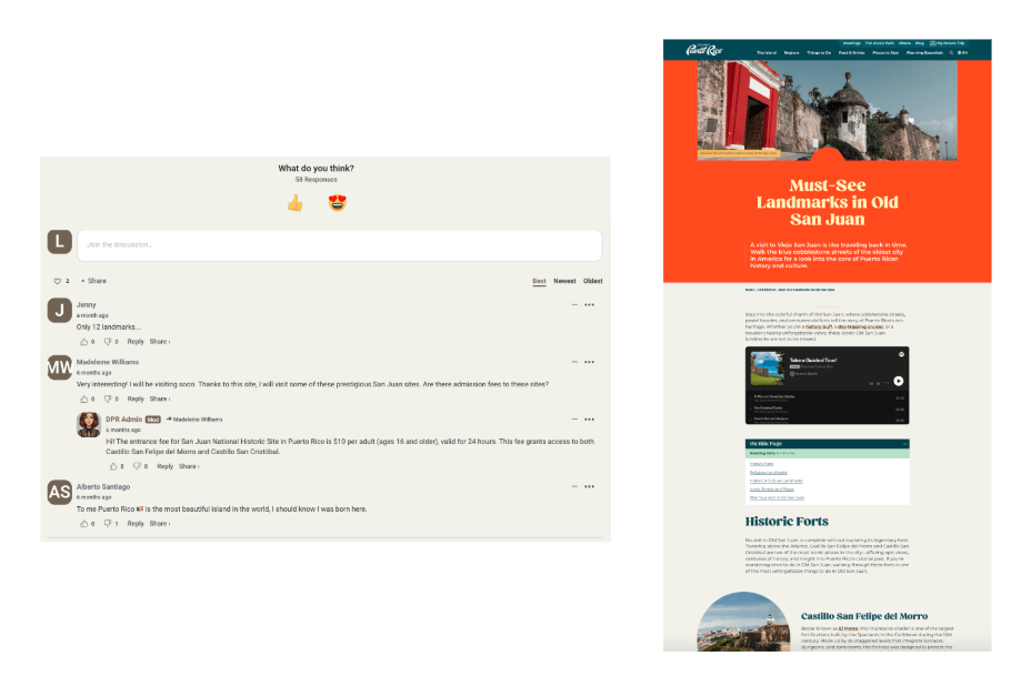
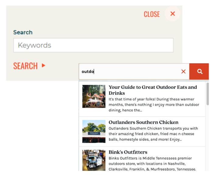
Come for the SEO, Stay for the Soul
With Natural Language Processing working behind the scenes, users don’t just browse—they tumble down storytelling rabbit holes. Discover a music festival and end up learning about a local legend. Commenting features turn passive scrolling into real conversations. It’s Google-friendly, yes—but more importantly, it’s community-powered.
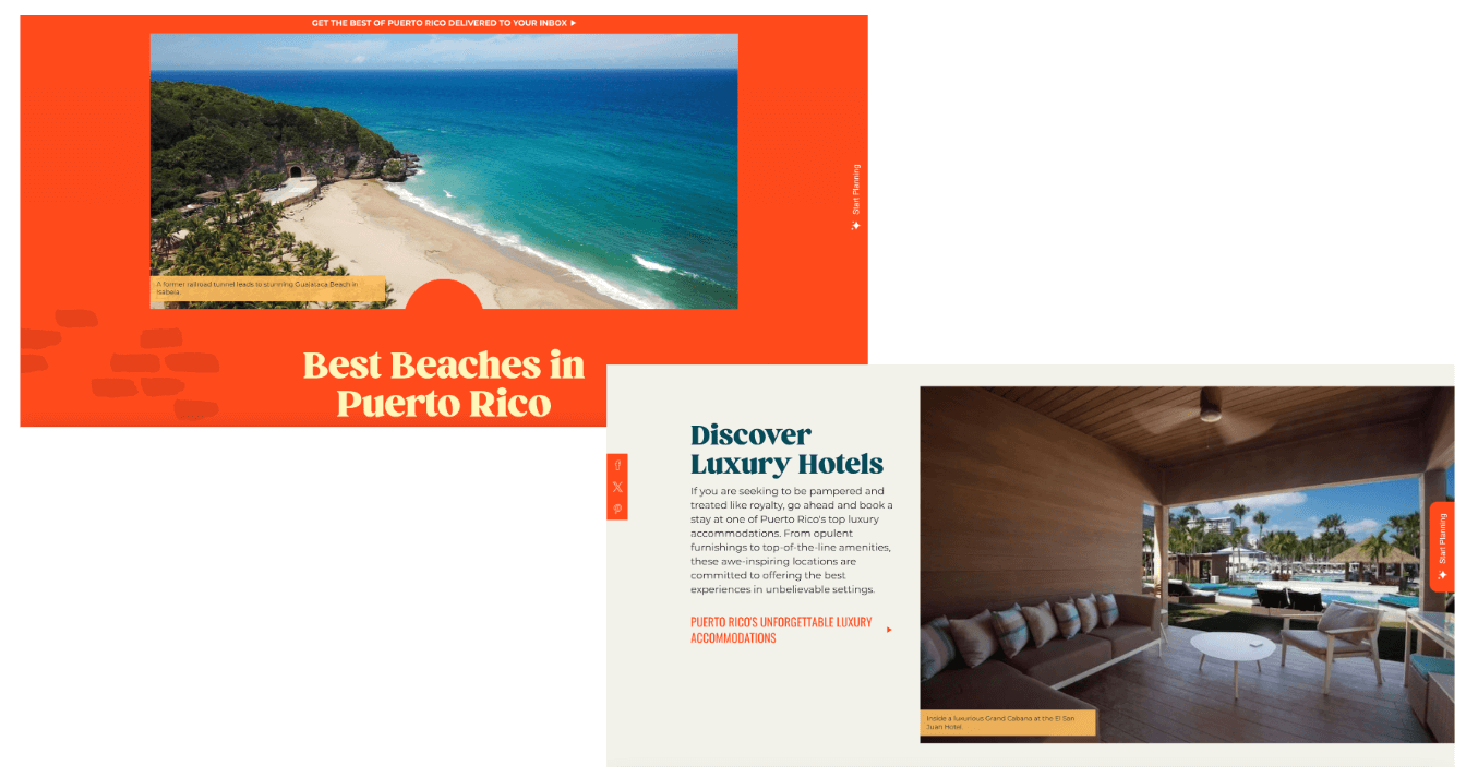
Content Expansion: Friendly by Design
Long pages? Short attention spans? We built a better way to serve up info. This new content expansion offers quick-hit takeaways with optional deep dives—making the site easier to scan, faster to navigate, and more fun to explore. We introduced region callouts, estimated read times, and modular “learn more” options that keep users in control of how they consume content.
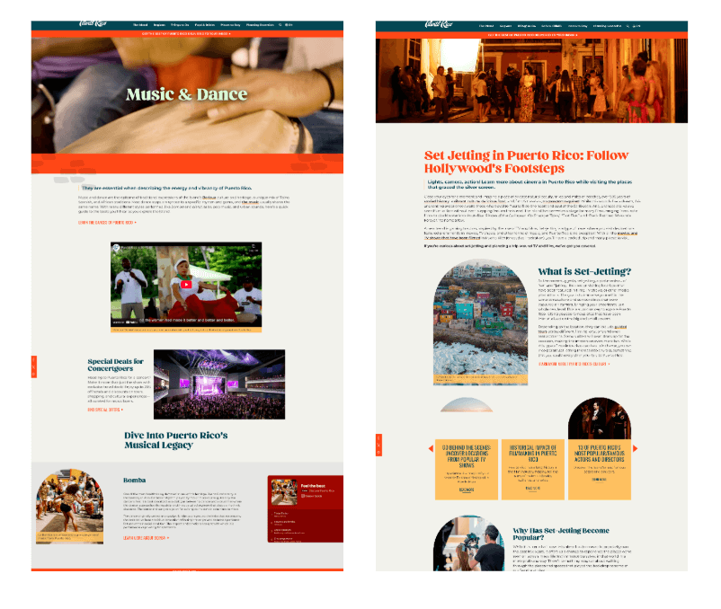
Content Hubs with a POV
To make sure no gem goes undiscovered, themed hubs center on Puerto Rico’s biggest cultural flexes—Baseball, Set-Jetting, Music & Dance. These aren’t content piles. They’re curated experiences designed to keep users engaged and SEO on point.
Built for Everyone It Serves
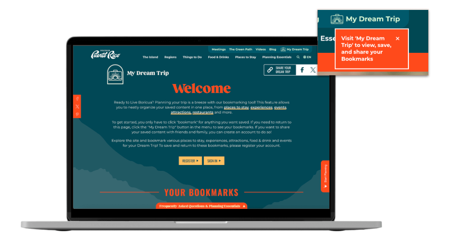
And perhaps the most important part: the site reflects the Island’s people. Human-translated content honors local dialects and culture. Every feature was built to include, not exclude. Because when a digital platform is made with care and cultural fluency, it becomes something rare—a tool for both visitors and locals.
Results
Organic Impressions
Increase in Total Users
Increase in Web Sessions
Monthly Organic Search Sessions
Increase in Page Views


